About
(Est. 1968) “Valpak is at the heart of communities across North America, helping people save, businesses grow and neighborhoods thrive through a network of local franchises in the U.S. and Canada. Valpak marketing consultants live and work in your neighborhood. We know what your customers want (we are them!) and can help you take the guesswork out of advertising with real-world marketing solutions that drive measurable results. From the mailbox to online to mobile devices, Valpak continues to find innovative ways to connect businesses with consumers. Monthly, close to 40 million homes receive our Blue Envelope of savings and traffic on valpak.com and our syndication partner sites exceeds 110 million. Backed by the muscle of Cox Target Media, your local Valpak office has the means and know-how to custom build a marketing campaign that meets your needs and budget.”
Design By
N/A
Valpak press release
The new Valpak logo and positioning are designed to bring fun and energy to the product and to share with both consumer and merchant audiences more about Valpak's commitment to its customers where they live, work and play.
Opinion/Notes
The old logo was so forgettable that I've been receiving the Valpak coupon mega envelope for the last 6 years and never realized it came from something called Valpak. It wasn't a terrible-terrible logo but it looked like all the cheap graphics in the coupons that it blended in a bit too well. The new logo is surprisingly notterrible. The double-house-with-a-smile icon is cloying but it has its charm and the wordmark is quite decent and is probably the most out of the ordinary lock-up we've seen here in years. So, well done Valpak, this could have sucked!
Logo detail.
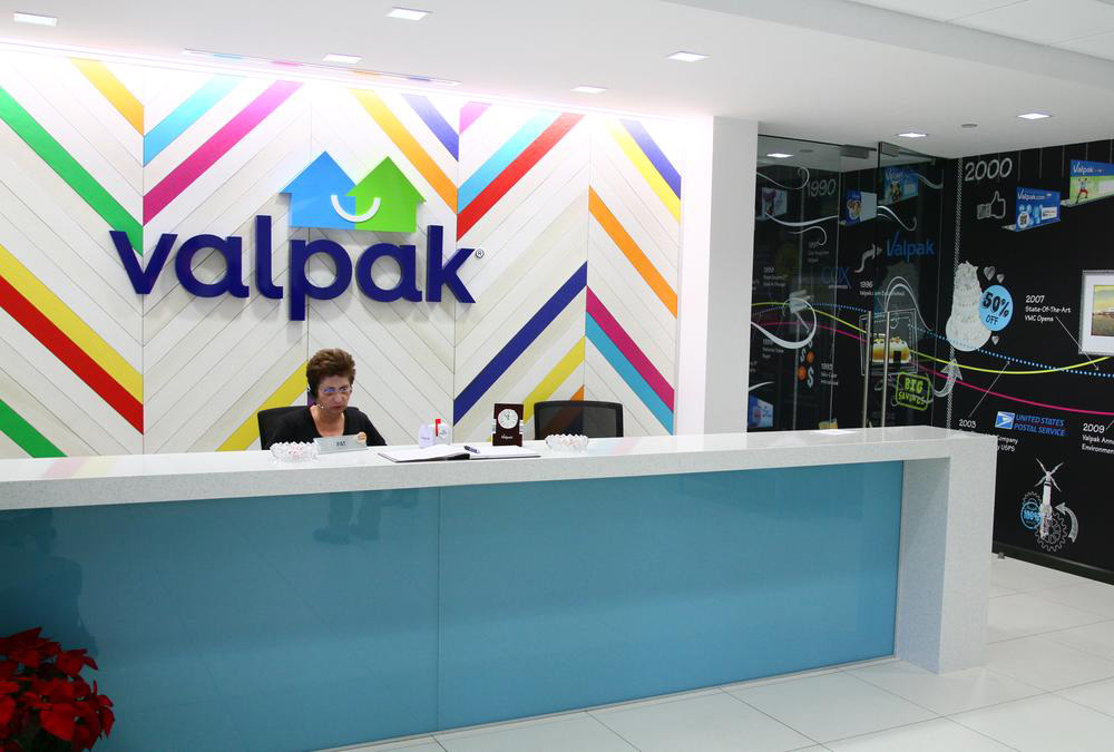
New office lobby. (Source)
Valpak intro video. Those poor actors. That’s one awkward gig… “Okay, now look at each other”, “Mechanic, fondle your rag more”, “Now look at each other again”, “Smiling!”.
Thanks to Kevin Hammond for the tip and Brand New for their constant updates and great content.


